
Wine doesn’t always have to be serious. If, instead, you take your fun time seriously, your wine should fit the moment. Unfortunately most packaging is more about educating and conforming to numerous legal requirements than making the wine part of the fun.
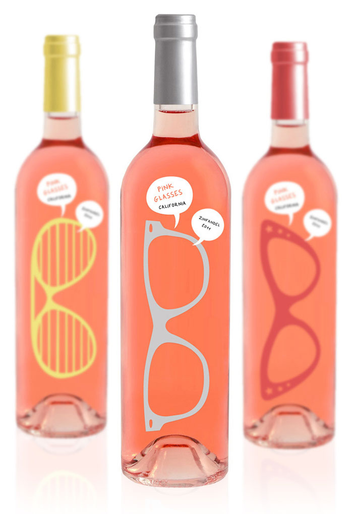
That’s why I liked this ‘concept’ for wine packaging found on The Dieline (a fantastic resource for anyone who likes packaging innovation).
“Pink Glasses” perfectly fits the target market of younger, female drinkers who enjoy the lighter, fruitier wine styles that are great for parties and other relaxed events, not the preserve of wine snobs. I particularly like the idea that the bottle itself is part of the wine appreciation experience, focusing on the sense of colour – as they say, giving “life through rose tinted glasses” a new meaning.
Anything that engages the consumer with the wine they are drinking as something other than merely an alcohol delivery mechanism is a good thing. Its great that we can appreciate this wine via the sense of sight not just smell and taste.
The downside is that the more you consume, the more fun the game of looking through the bottle might become, and this works best with properly sealed bottles!!
More fun examples like this, please!



July 31, 2012
The effect will be ruined when they add the back label!
July 31, 2012
he he – good point, but there is no reason they could not add a clear substrate with visible writing on the side of the bottle instead, or on the very bottom. I think it could still work 🙂